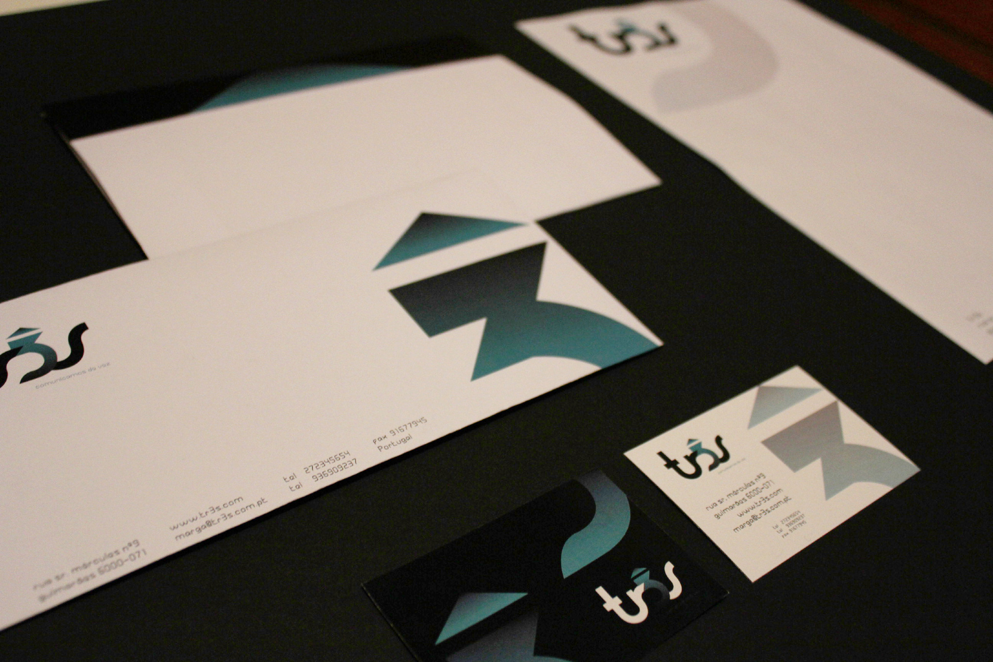
The aim of this work was to develop the graphic design of a communication label, which I decided to call "tr3s".
All the steps are important in this conception, it has a logical order and chain. First we have to do the naming, then the logo and its design, at last the manual standards and the stationary.
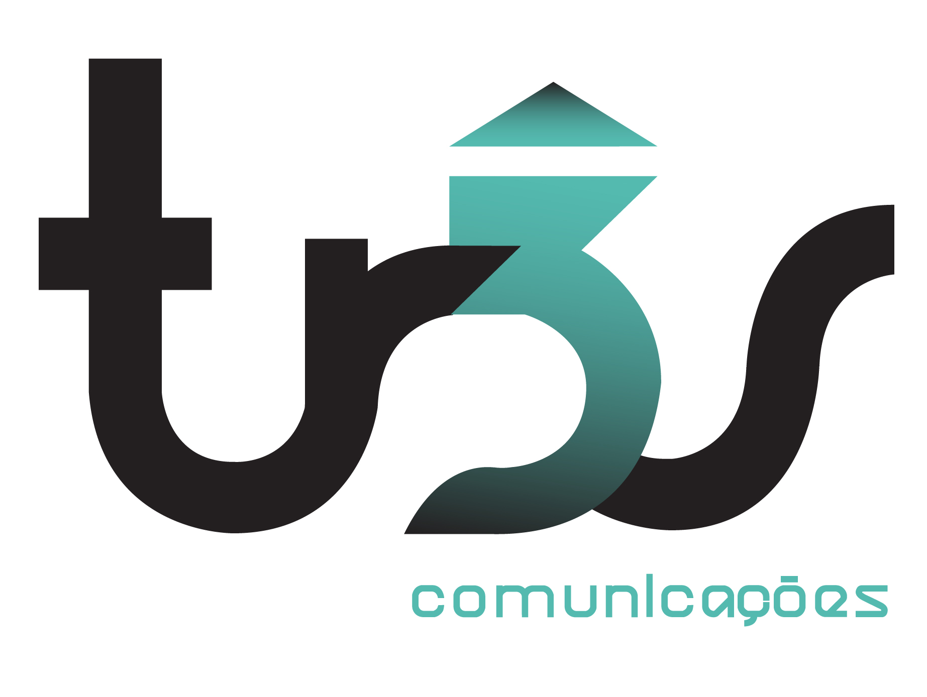
I chose the name "tr3s", because it's an operator that has three services: television, phone and internet,
to appeal the young consumers.
Symbolically this number represents a bond and a balance I think it was fun to change the "e" and have it replaced by "3", and I think this made the logo more dynamic and different.


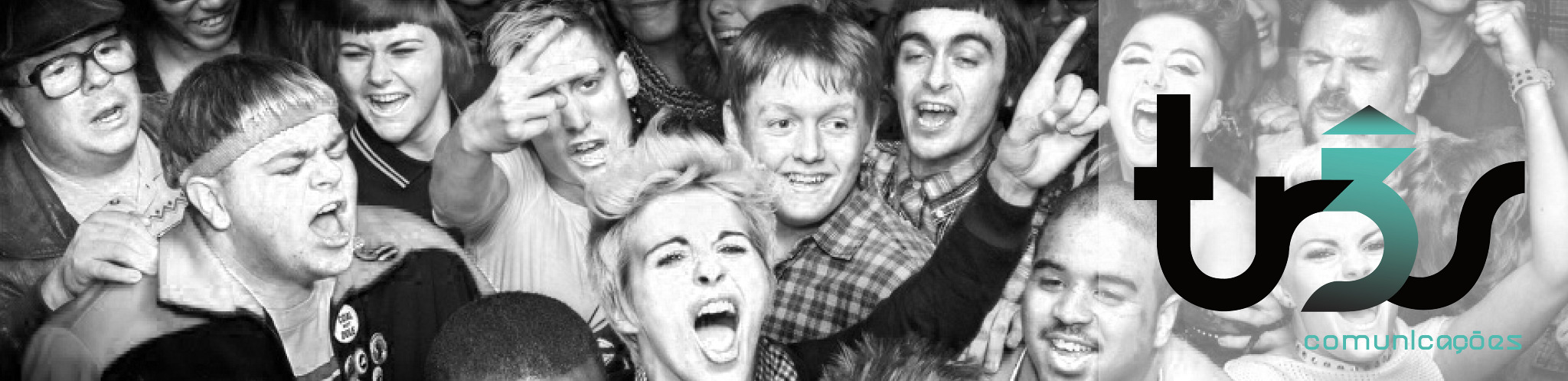
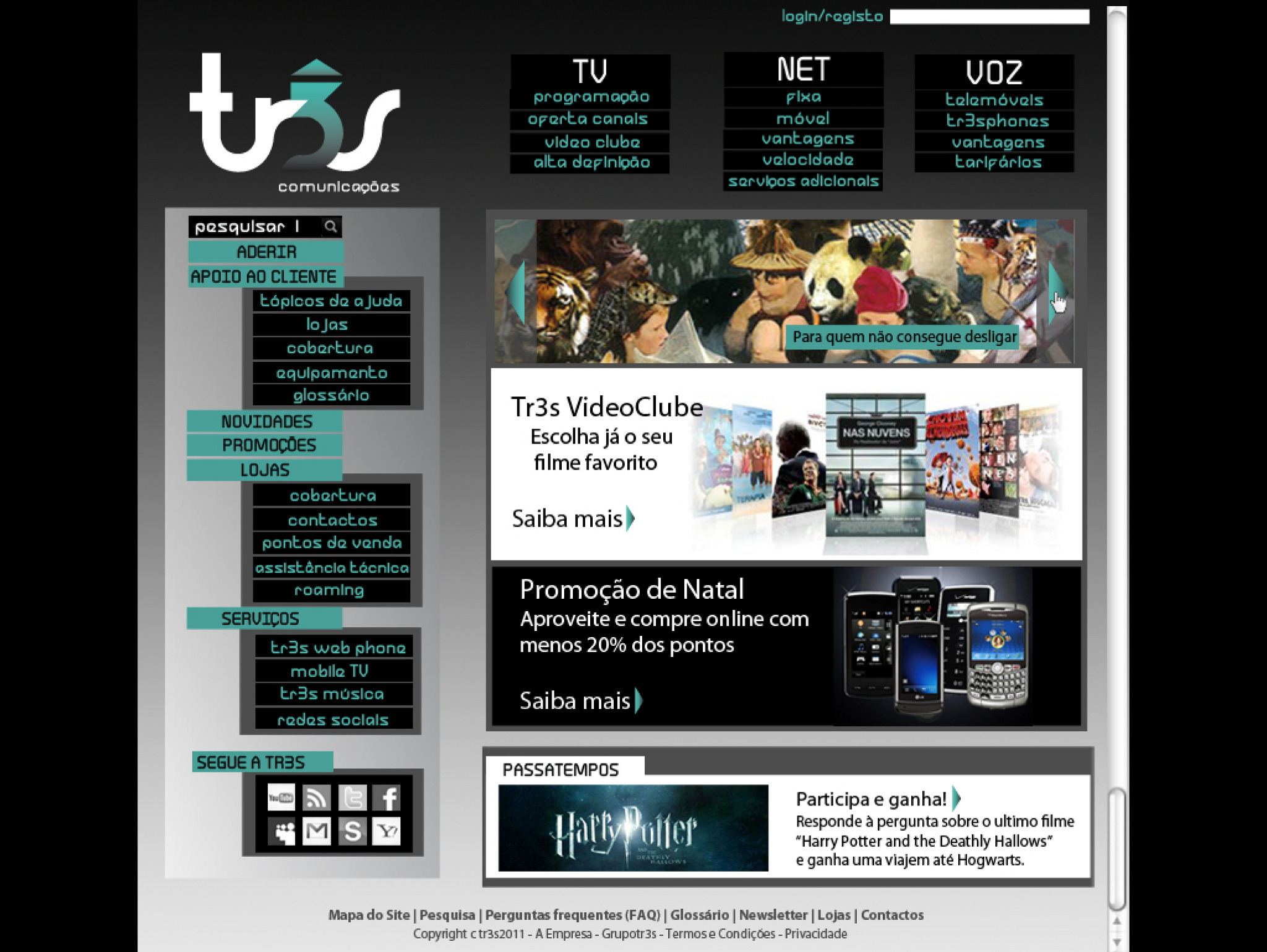
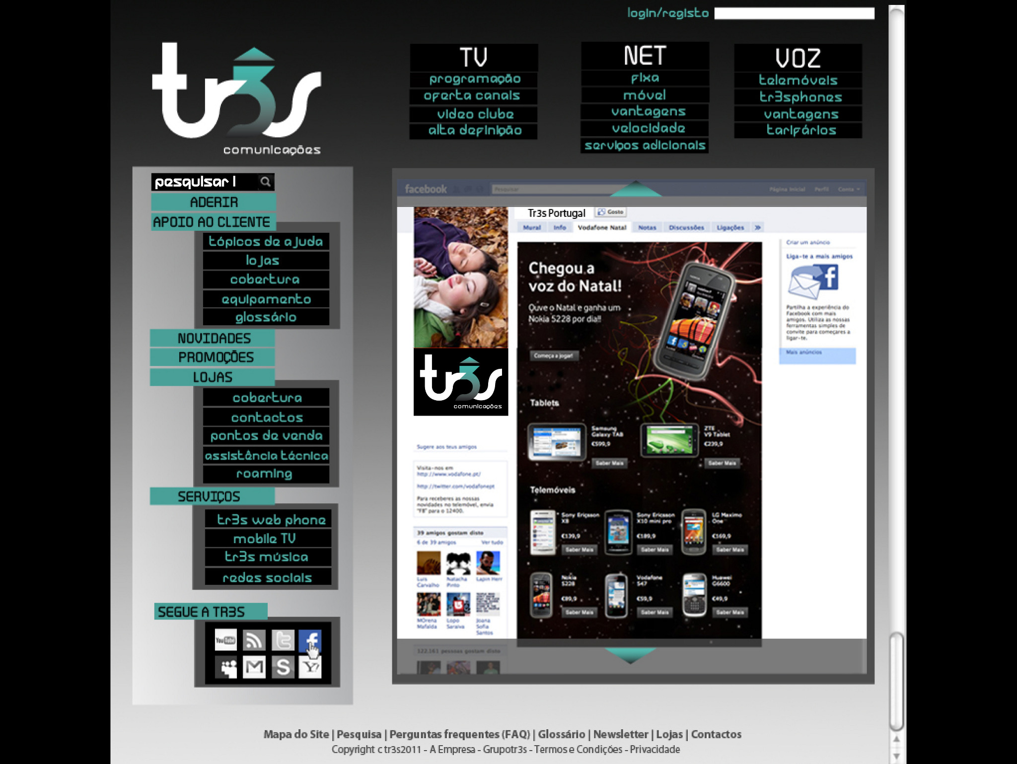
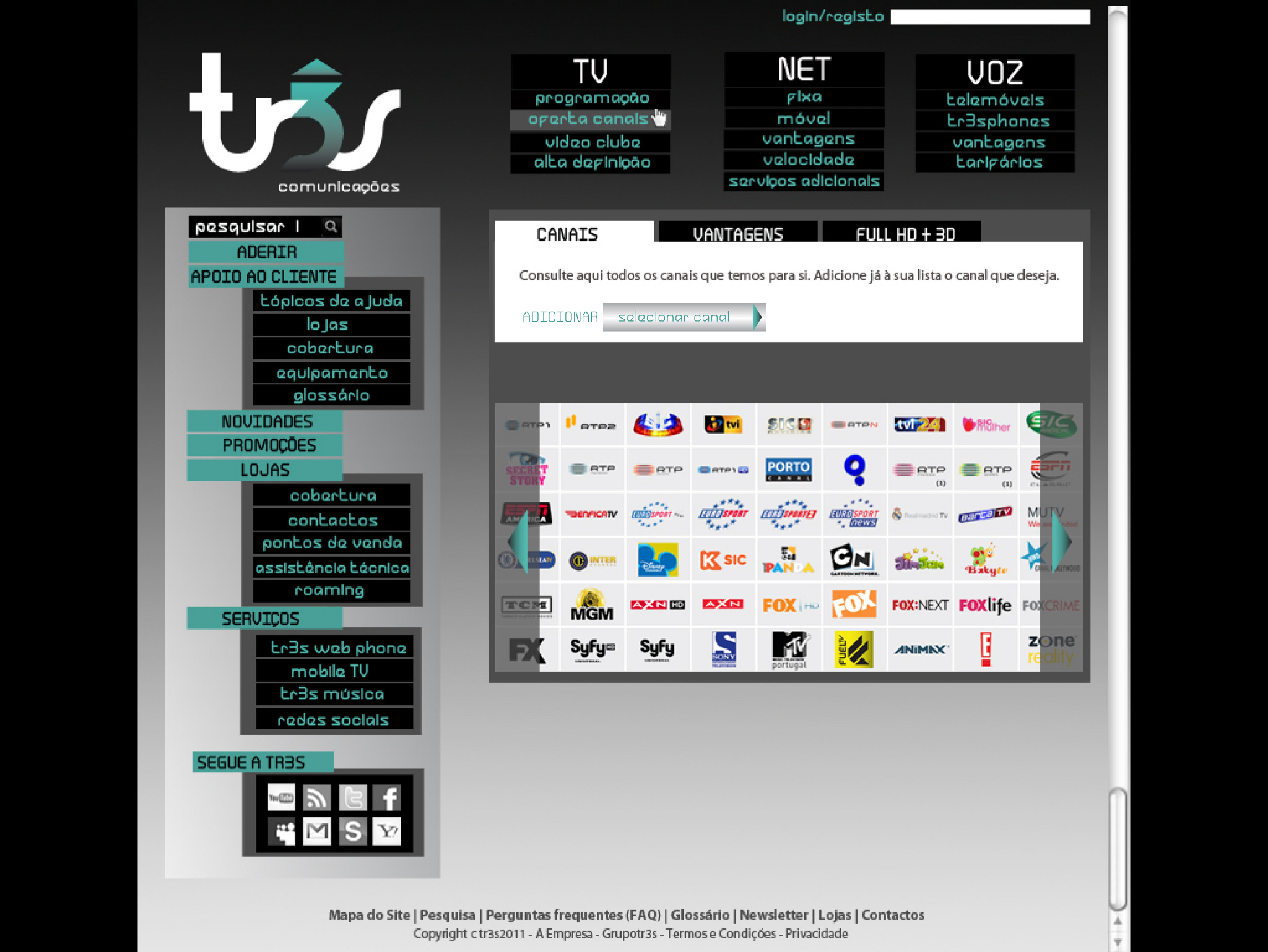
I also had to do the layout of a website, as a sequence of the previous work, so I based my work on the same
colours, font and graphics of the label "tr3s", so that it could be applied on all the web pages. The site contains all the useful information to the client.